
#025 Should I Use Slides, Animations, or Infographics for Science Talks?
- Dr Elisabeth Kugler

- Aug 28, 2025
- 4 min read
Table of Contents
Standing in front of an audience - whether it’s a room of 150 people at a conference or a casual public engagement event in a pub – is ..
Well, often nerve-wrecking.
But also, a unique opportunity to make a lasting impression.
The way you present your science can either captivate your audience or leave them disengaged.
Many scientists default to slides, but are they always the best option?
What about animations or infographics?
And what role do interaction and storytelling play in making science talks truly memorable?
In this post, we'll explore the pros and cons of various presentation formats, discuss strategies for making talks engaging, and provide real-world examples.
1. The Power of Storytelling: More Than Just Slides
One of the most impactful science talks I ever attended didn’t rely on slides.
A clinician presented patient stories, including a short video interview where patients described their experiences managing a chronic illness.
Within minutes, the entire room was in tears.
It was no longer about the genes, the medication, or clinical trials – it was about the patients.

When the clinician then presented their finding, the emotional connection they had created made the science more memorable than any data-heavy PowerPoint could ever have.
The key takeaway?
People remember emotions, not just facts.
2. The Pitfalls of PowerPoint: Death by Slides
PowerPoint has been the default for scientific presentations for decades, but let’s be honest - many of us have suffered through "Death by PowerPoint".
My Own Experience with Slide Overload
During my PhD, I was terrified of getting things wrong. To compensate, I rehearsed my talks to perfection, sticking rigidly to my slides.
The result? A technically flawless but uninspiring presentation.
There was no real relationship with the audience because I was focused entirely on getting my wording right.
Now, I have learned to step away from slides when possible.
I focus on interaction, exercises, and facilitation techniques that encourage the audience to explore concepts themselves.
I LOVE creating "Aha!" moments where the audience’s curiosity piques and they don’t just passively receive information.
Be like Amazon!
Amazon meetings are famously PowerPoint-free (read more). Instead, they use written memos that are shared at the beginning of the meeting.
Everyone reads the memos in silence together.
Could this be adapted for science talks? Absolutely!
Imagine distributing a short, structured summary at the start of your talk instead of presenting slides.
Take it a step further with Live Demonstrations:
Instead of showing an image of an experiment, why not bring a sample?
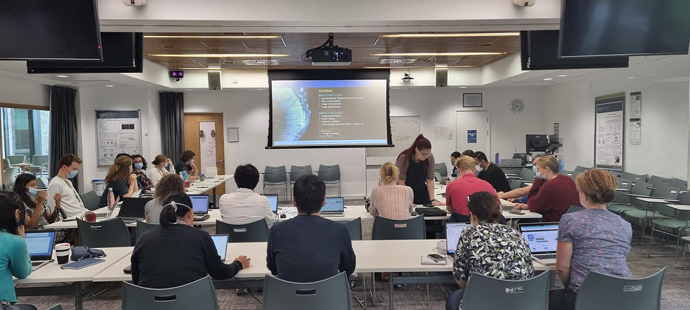
In past talks, I’ve dragged microscopes, samples, and 3D models into pubs for events like Pint of Science - it made the science far more tangible and engaging.
3. Animations: When and How to Use Them
Animations can be fantastic tools for explaining complex biological processes, physics phenomena, or engineering concepts that are otherwise difficult to visualize.
But are they always the best choice?
When Animations Work Well:
Molecular Biology: Processes like protein folding or CRISPR gene editing are hard to describe in words but easy to understand through animations.
Physics: Concepts like wave interference become much clearer with motion-based visuals.
Remote Audiences: In online talks, animations can be a great way to maintain engagement.
When Animations Can Be a Distraction:
Too Complex: Some animations require so much effort to understand them that the audience loses track of the main message.
Replace Speaker Engagement: A common mistake is pressing "play" on an animation and then passively watching along with the audience. The speaker should still guide the explanation.
4. Infographics: The Science of Simplification
Infographics distill complex scientific information into a clear, easy-to-understand visual format. They are particularly effective for public engagement and media communication.
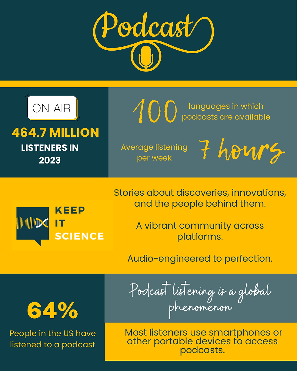
Why Use Infographics in Science Talks?
They summarise key takeaways in a visually engaging way.
They make data more accessible to a lay audience.
They improve retention—people remember 80% of what they see versus 20% of what they read.
Book recommendations:
Storytelling with Data: A Data Visualization Guide for Business Professionals, 2015 by Cole Nussbaumer Knaflic
The Visual Display of Quantitative Information Hardcover, 2001 by Edward R. Tufte
Dear Data: A Friendship in 52 Weeks of Postcards, 2016 by Giorgia Lupi and Stefanie Posavec
Example: During the COVID-19 pandemic, infographics were a useful tool to explain virus distributions.
5. Finding the Right Balance: A Case Study
Imagine you’re giving a talk on antibiotic resistance. What’s the best way to present your key points?
A slide deck filled with dense text? Audience disengagement guaranteed.
Try..
A short animation of bacterial evolution? Engaging, if well-paced.
A live demonstration with Petri dishes? Memorable, if practical.
An infographic summarising key facts? Useful for take-home messaging.
A combination approach - brief slides, an animation, a live demo, and a takeaway infographic - might be the most effective way to communicate your science.
Final Thoughts: Be Bold and Experiment
The best science talks aren’t just about presenting information—they’re about building a relationship with the audience.
Whatever tools you use, the goal is to create a memorable and meaningful experience for your listeners.
Be bold in how you communicate science.
Try unconventional approaches, integrate interactive elements, and, most importantly, focus on the human connection - because that’s what makes science communication truly powerful.


Comments